My Roles
UX Researcher
Visual Designer
UX Writer
Context
This is a personal design case study and the designs here reflect an on going project for a mobile app called Mist.
Research and Inspiration
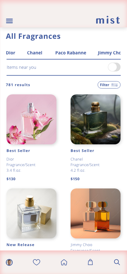
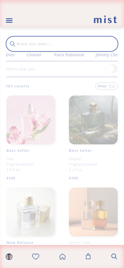
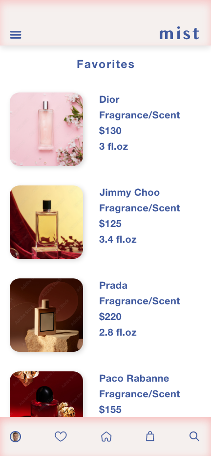
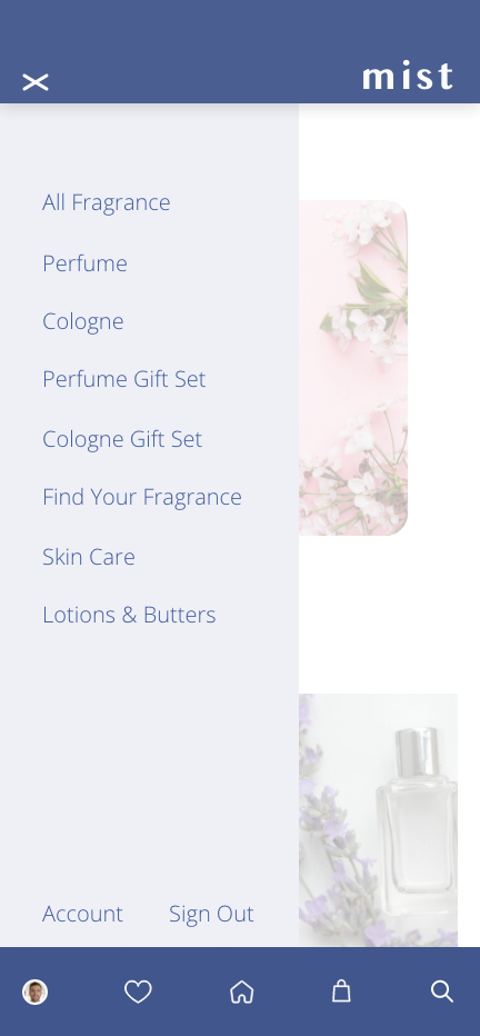
This design project consisted of researching competitive sites to get an idea of what kind of information to displayed on the home screen, product screens and checkout screens to provide customers with an idea of what Mist could be as a finished product.
Goal
My goal was to create a solution that provides the customer with a one stop shop for all their favorite perfumes and colognes with a luxury aesthetic and a personalized experience that would keep the user coming back.
What is Mist?
Mist is an app that sells some of the top luxury branded perfumes and colognes from across the world. A one stop shop for men and women fragrances giving the convience of avoiding long drives to your favorite malls, long lines and poor customer service. This is an app that tailors to you, your favorite smells and your favoirte brands.
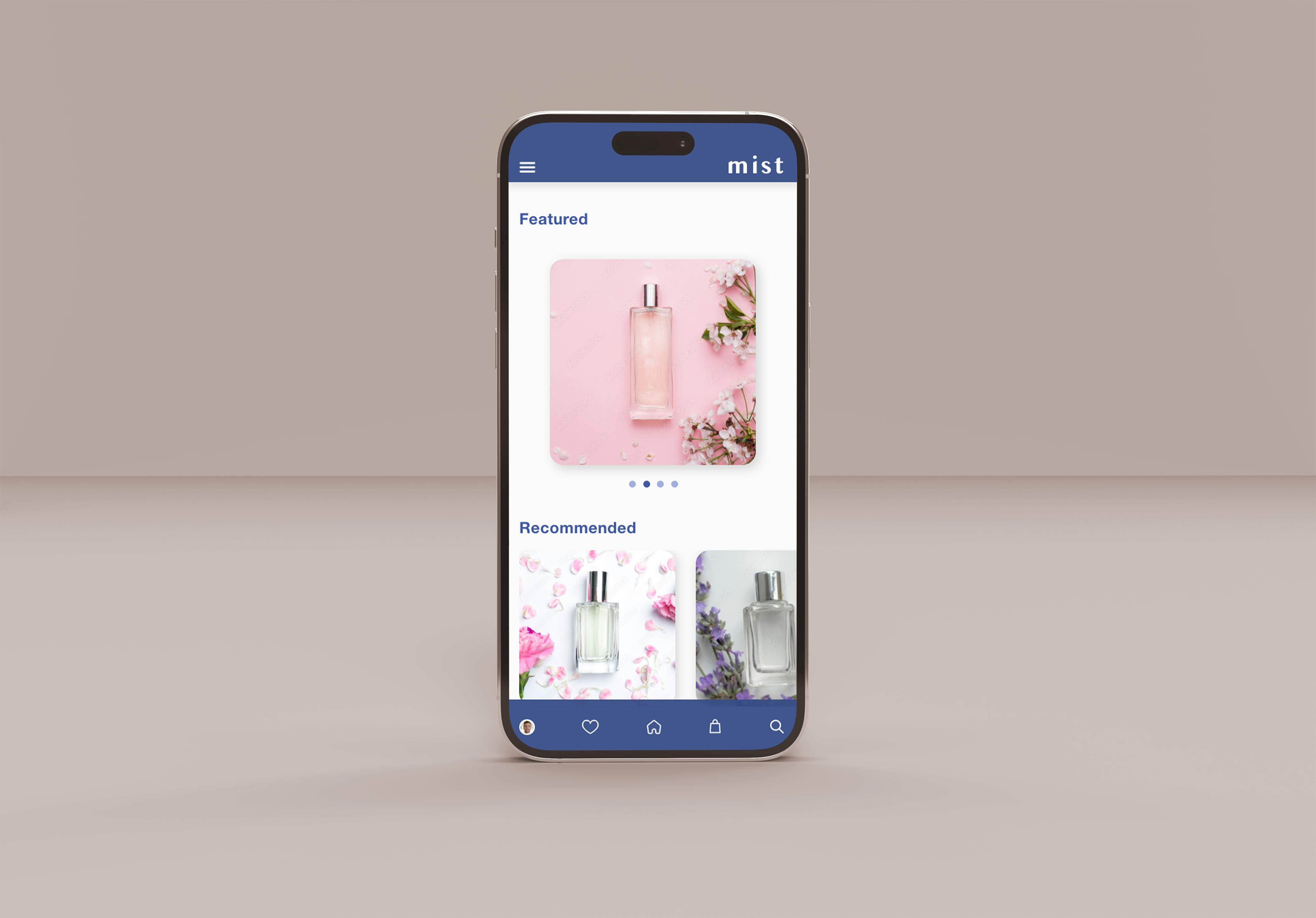
Here's a breakdown of the designs I've made.
The Logo


The logo for Mist is meant to be simple but bold and confident. The app is meant to be a premium experience for the user so I wanted the app as well as the logo to express that. The name is a representation of perfume spraying out of the bottle into the air and resting sublty on the skin. Mist is a spritz of self assuance and actualization.
The Colors


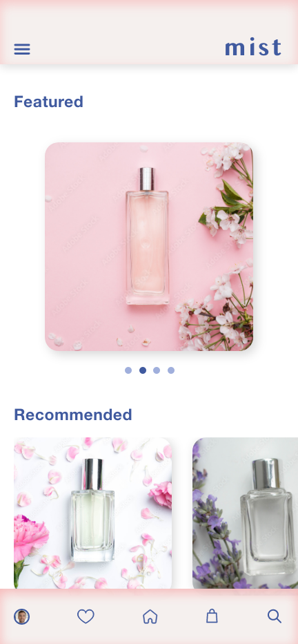
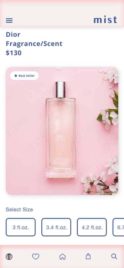
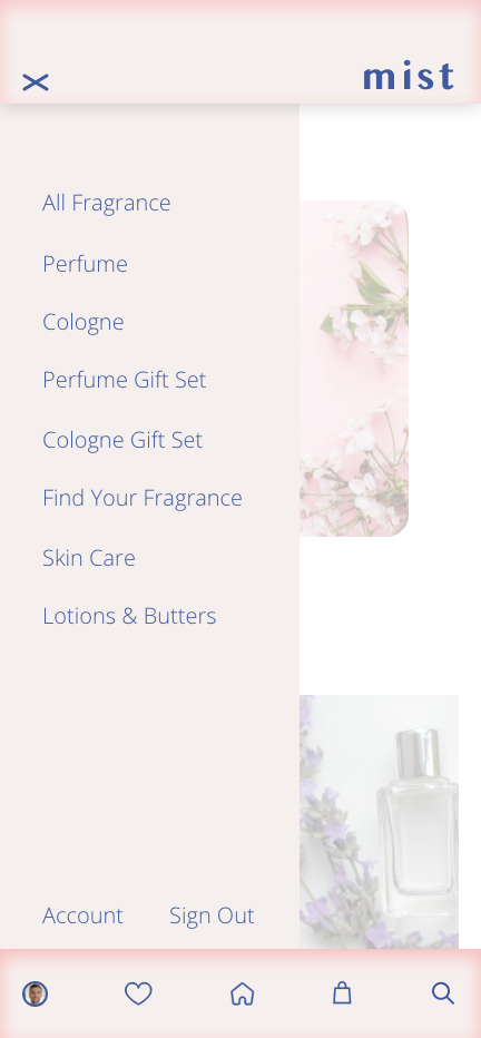
Choosing the colors were a specific step in the design process because I wanted this app to be accessible to men and women. The idea is to make the user experience open to anyone to enjoy shopping for their favorite frangrances and not feel alienated. While that may not be achievable 100% of the time, I felt a deep blue and a bright nude color would fit the mold.
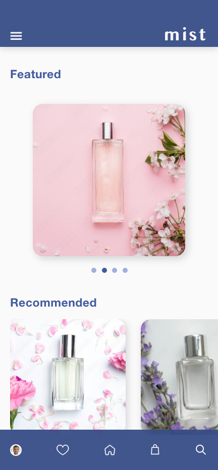
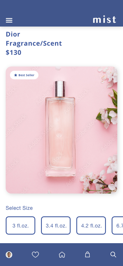
The two iterations here are what the two colors would look like without me fully deciding which color scheme would be best for a perfume marketplace.
The Design Layout


Much of the design layout was inspired by Nike.com. During my research I came across Nike.com and I liked how there products were displayed while viewing them on the mobile site. I thought of Mist as the one and only place you would and should go for all of your fragrance needs and I needed a good way to display many products. Nike was what I though would fit best.
The Solution
