My Roles
UX Researcher
Visual Designer
UX Writer
Context
This is a personal design case study, I do not provide design solutions for Virtual Payroll Resource and what I created does not reflect Virtual Payroll Resource design goals.
Research and Inspiration
This redesign project consisted of researching competitive sites to get an idea of what kind of information to displayed on the home screen to provide customers with an idea of who Virtual Payroll Resource are and what they offer, as well as, the UI design and navigation trends.
Goal
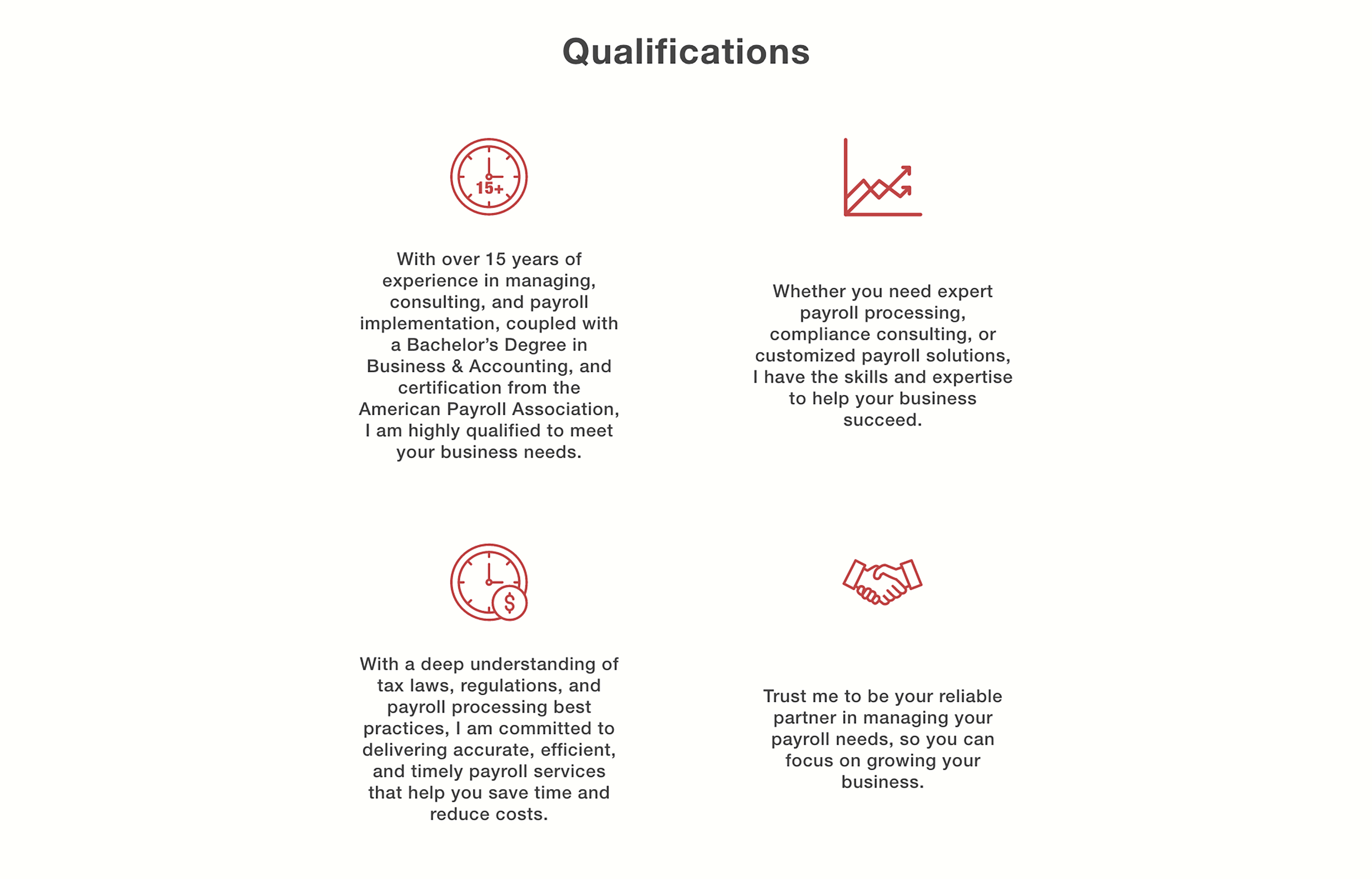
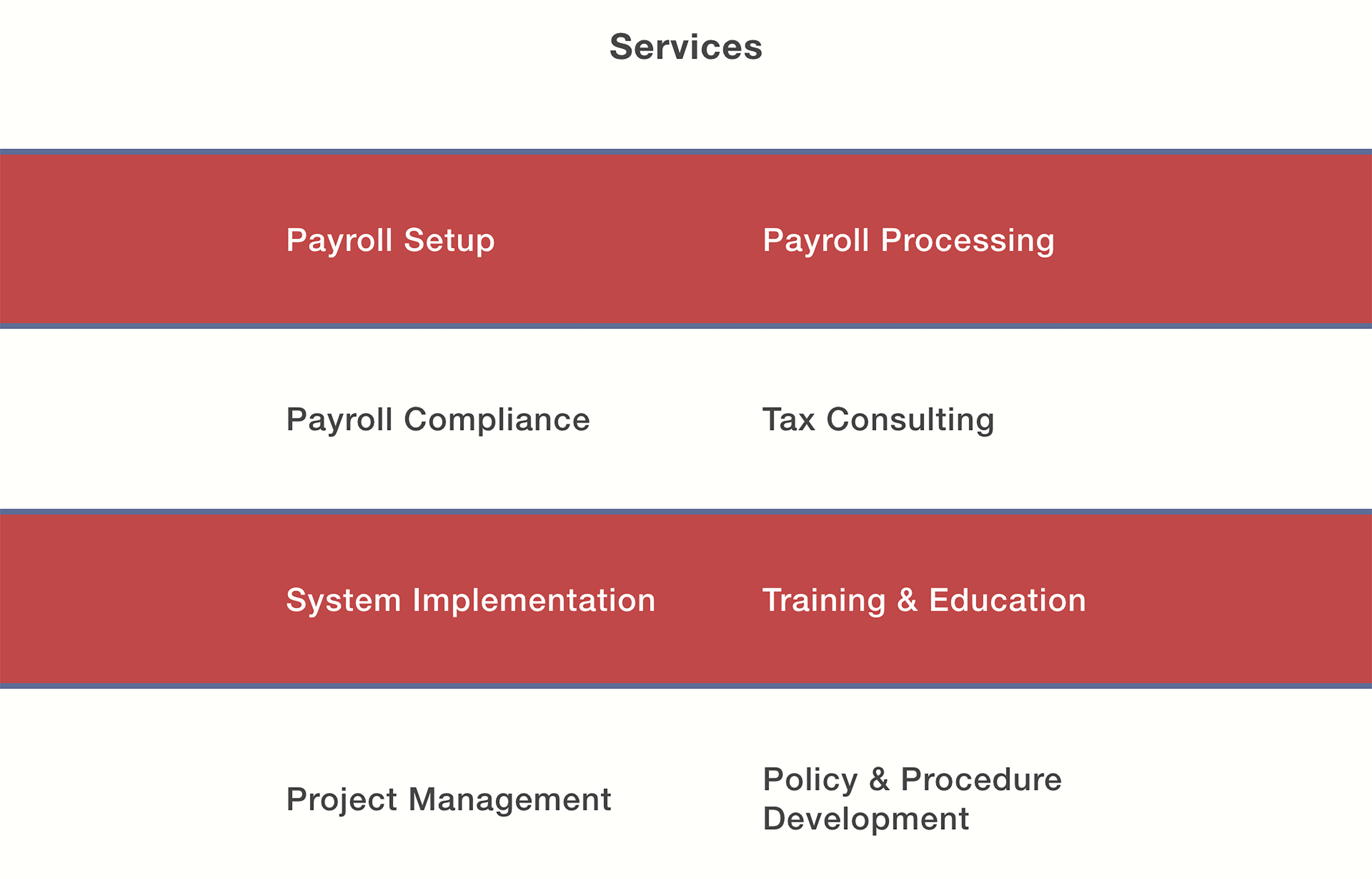
My goal was to create a solution that provided the customer with the necessary information to decide if Virtual Payroll Resource is the right payroll solution for your business.
What is Virtual Payroll Resource?
Virtual Payroll Resources is an independently owned payroll solution tailored to meet the needs of businesses of all sizes. With a strong commitment to accuracy, efficiency, and exceptional service, Virtual Payroll Resources offers comprehensive payroll services that ensure seamless and timely processing. What sets them apart is not only their dedication to providing top-notch solutions but also the pride in their ownership. As an enterprise owned by a black woman, Virtual Payroll Resources stands as a testament to diversity and empowerment in the business world, contributing to a more inclusive and vibrant entrepreneurial landscape.
Here's a breakdown of the designs I've made.
The Logo
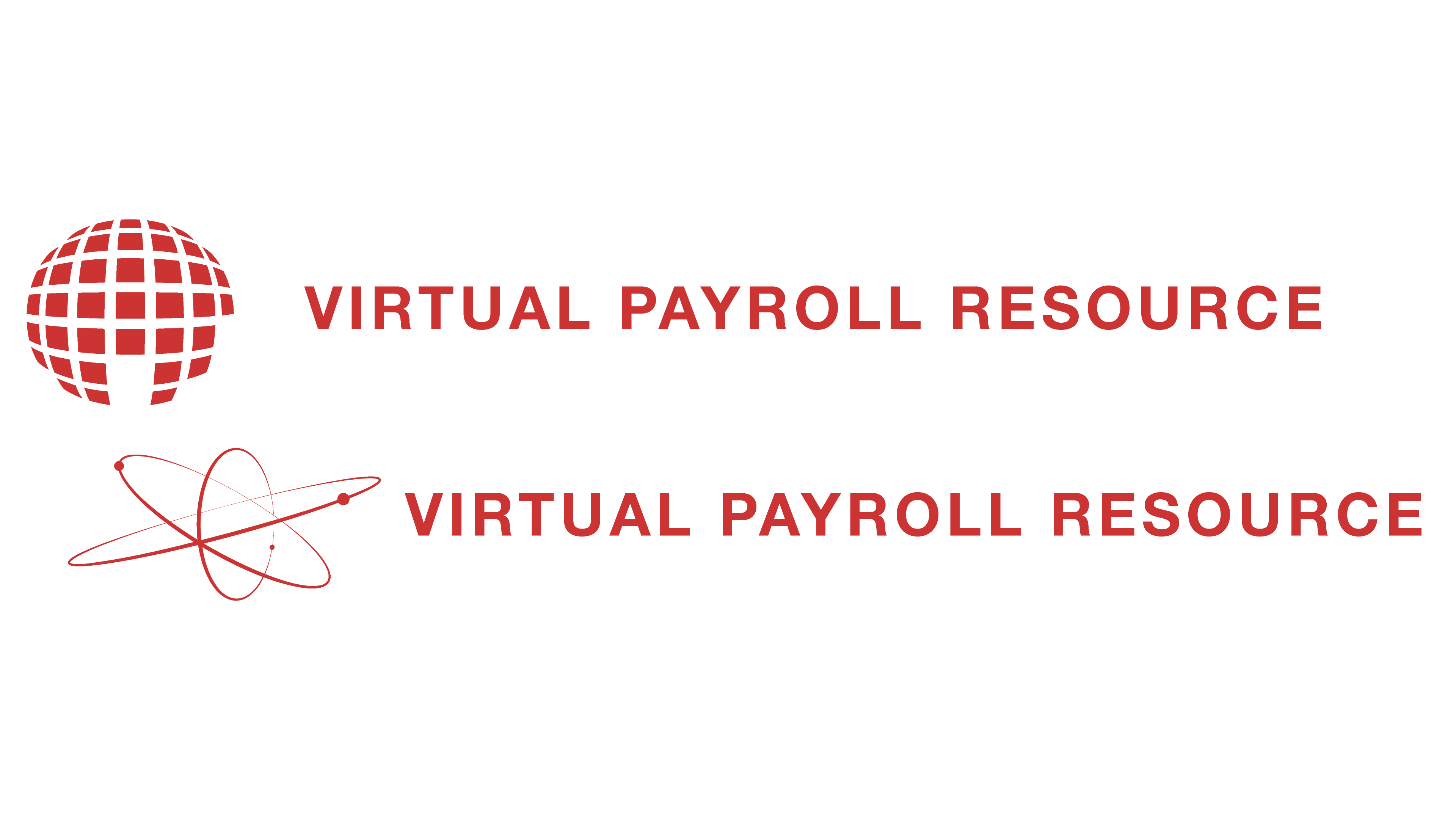
The logo design process went through a couple of iterations before finding the current solution. When I was presented with this project there were no previous logo designs, so I was starting from stratch. Naturally I was thinking, what could the name mean if there was a symbol that can represent the "virtual" In Virtual Payroll Resource. I began thinking in the realm of digital design solutions, with things like networks, computer programming languages, and the movie The Matrix 😅. With each symbol I created the name was present right next to it and I couldn't decide what would be the best solution was so I decided to drop the symbol and just keep the name 👍🏽.
The Design
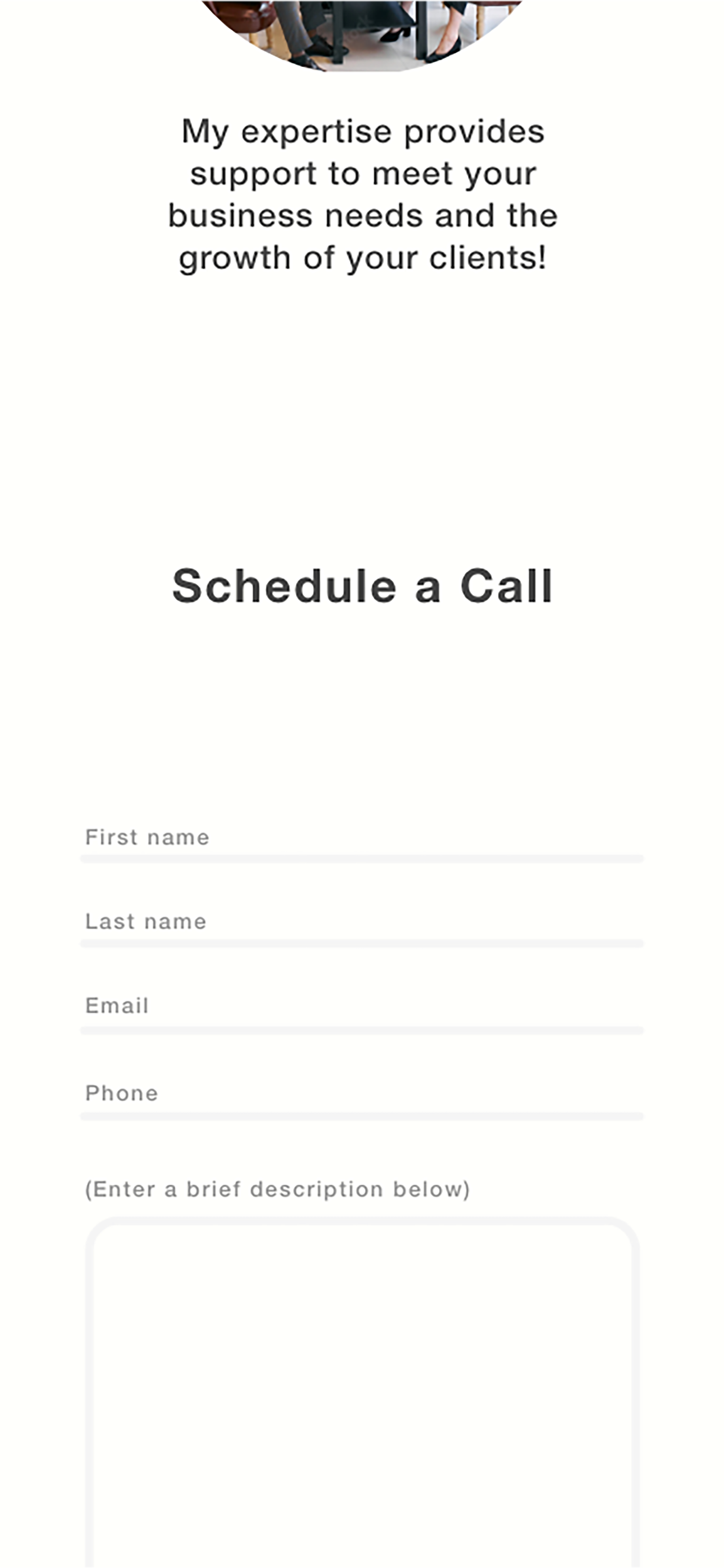
My design approach was trying to obatin an understanding on how can I display a Payroll service that is independently owned while the owner is the sole employer. After researching online for top payroll services like ADP, Gusto, and others I got a better understanding of the type of information displayed on their sites. But this was a payroll service without a huge team behind it and the information I had available to me was their LinkedIn, so I decided to approach it as though it was an online resume with copy and call to actions that will prompt a visitor looking for payroll services to respond.
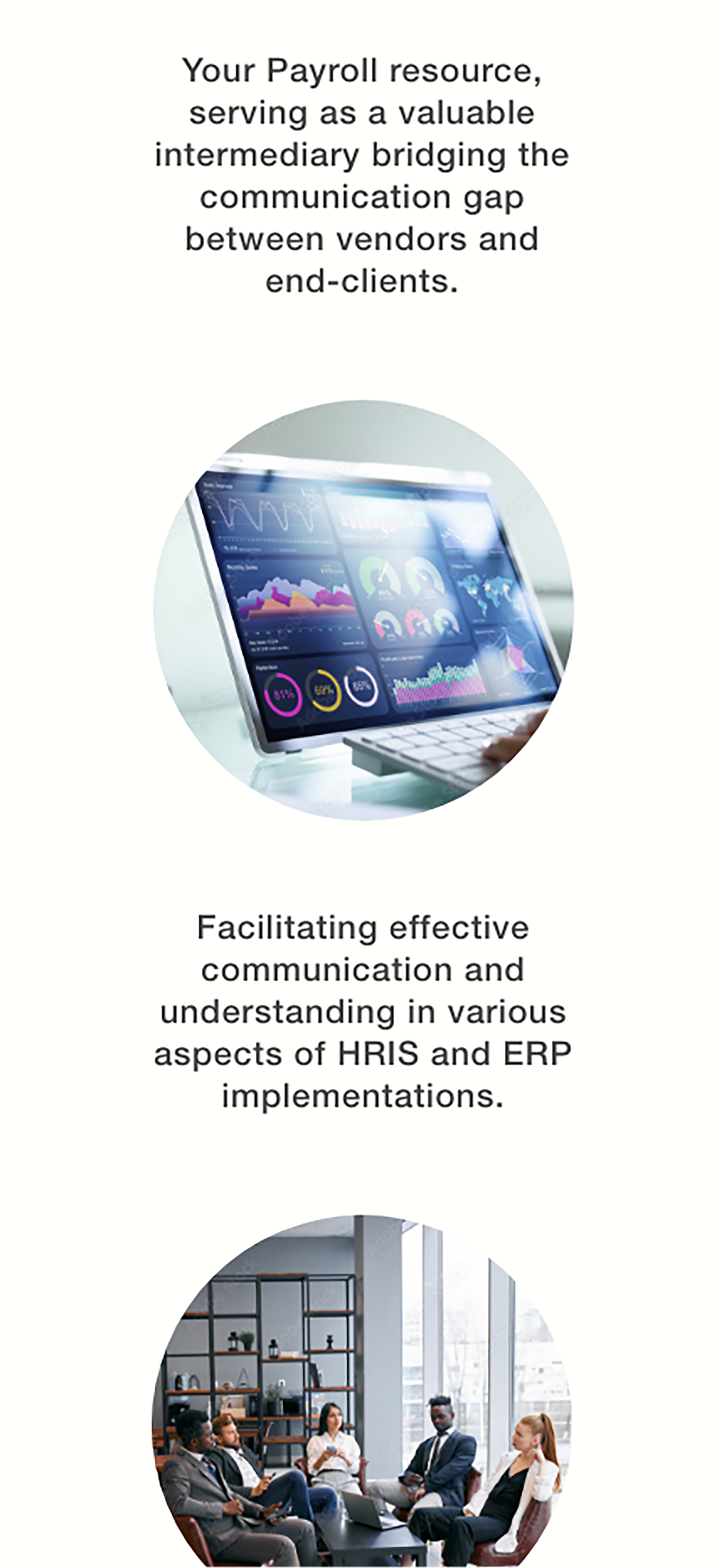
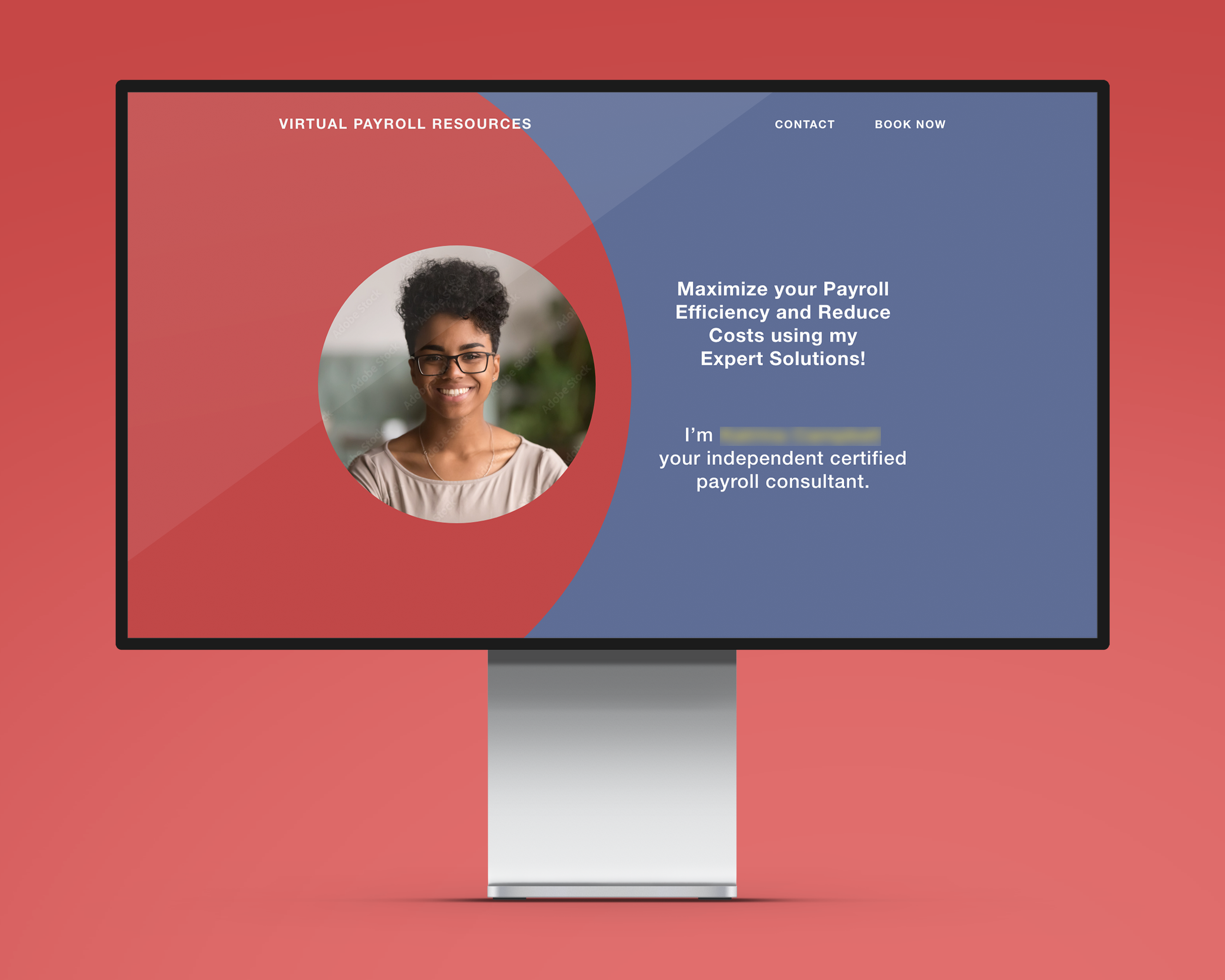
The Hero Section
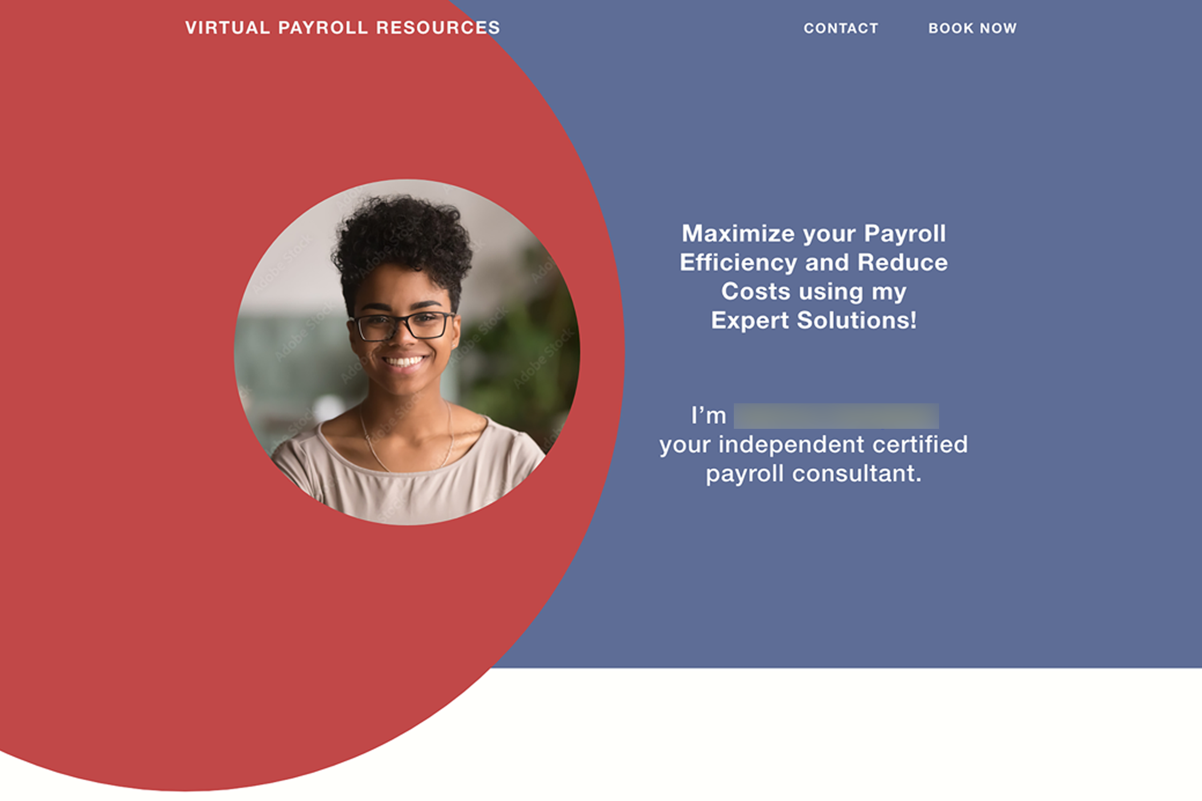
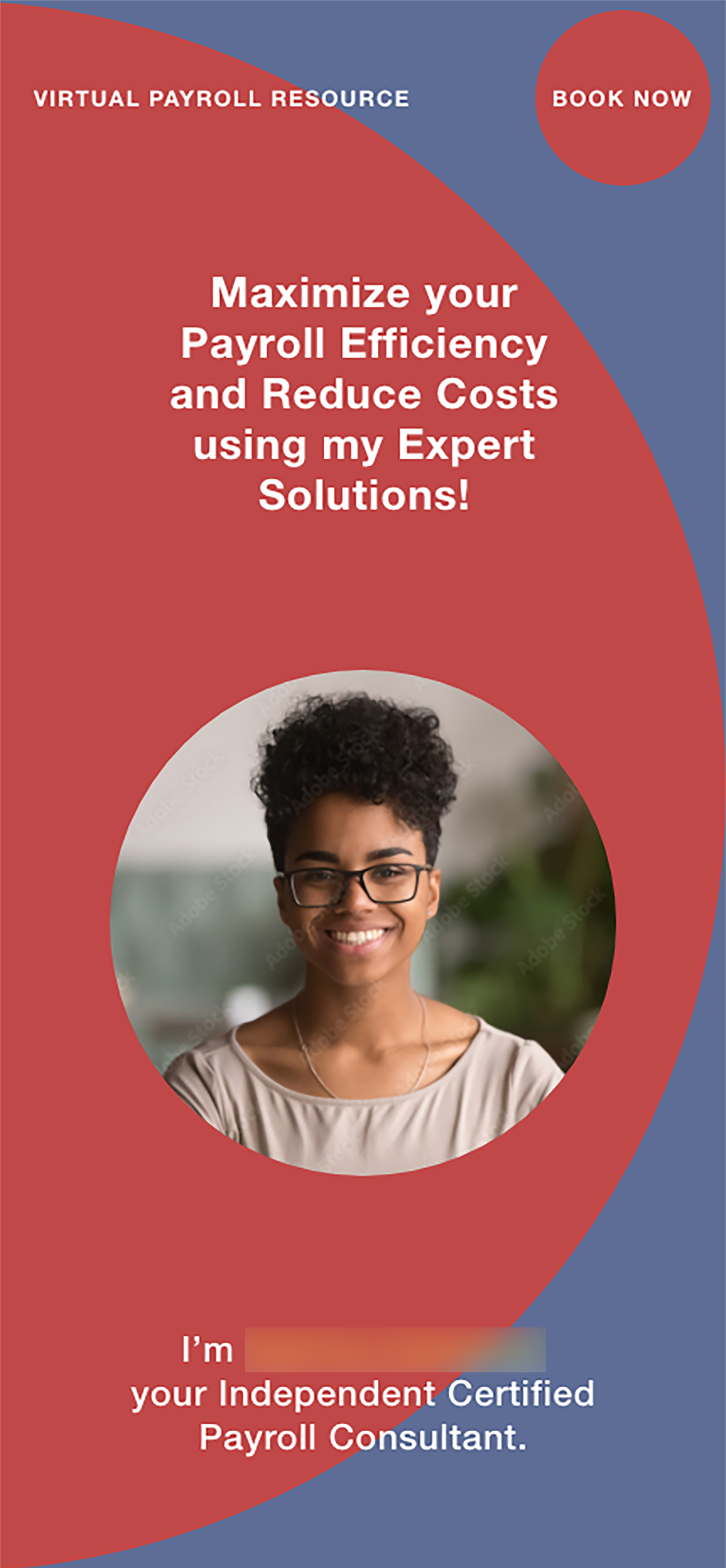
The Hero Section is the eye catcher on a website so I designed this to be first section that appears when you load the page. I wanted this section to be the introduction to who Virtaul Payroll Resource is to give a visitor information that directly coresponds to what solutions Virtual Payroll Resource provides.
The Solution