My Roles
UX Researcher
Visual Designer
UX Writer
Context
This is a personal design case study and the designs here do not reflect That Ara Girl or their marketing team.
Research and Inspiration
This design project consisted of researching competitive sites and the That Ara Girl website to get an idea of what kind of information to displayed on the home screen, product screens and checkout screens to provide customers with an idea of what That Ara Girl could be if it was designed by me.
Goal
My goal is to create a solution that provides the customer with a simple and premium asthetic user experience when shopping from a luxury lounge wear site.
What is That Ara Girl?
That Ara Girl is a luxury comfort clothing brand that currently sales pajamas, scarves and robes. That Ara Girl is meant to provide their customers with a sense of stlye and comfort in any situation, environment or gathering. Started by a Nigerian born fashion blogger turned entreprenuer, Ara believes that loungewear should be more than comfortable but an extension of your personal style.
Here's a breakdown of the designs I've made.


The Website Layout
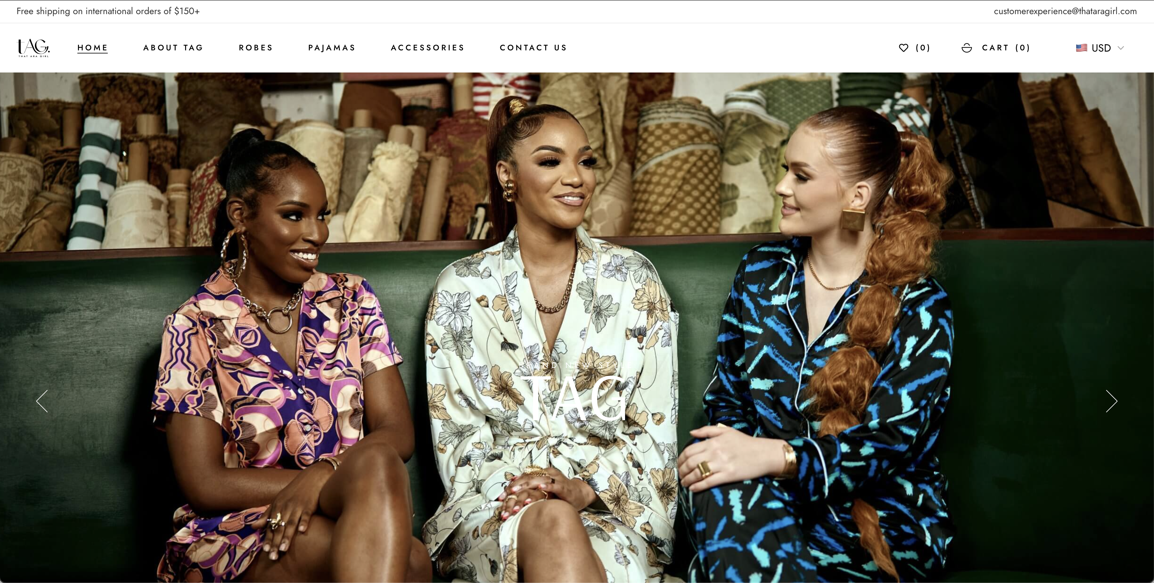
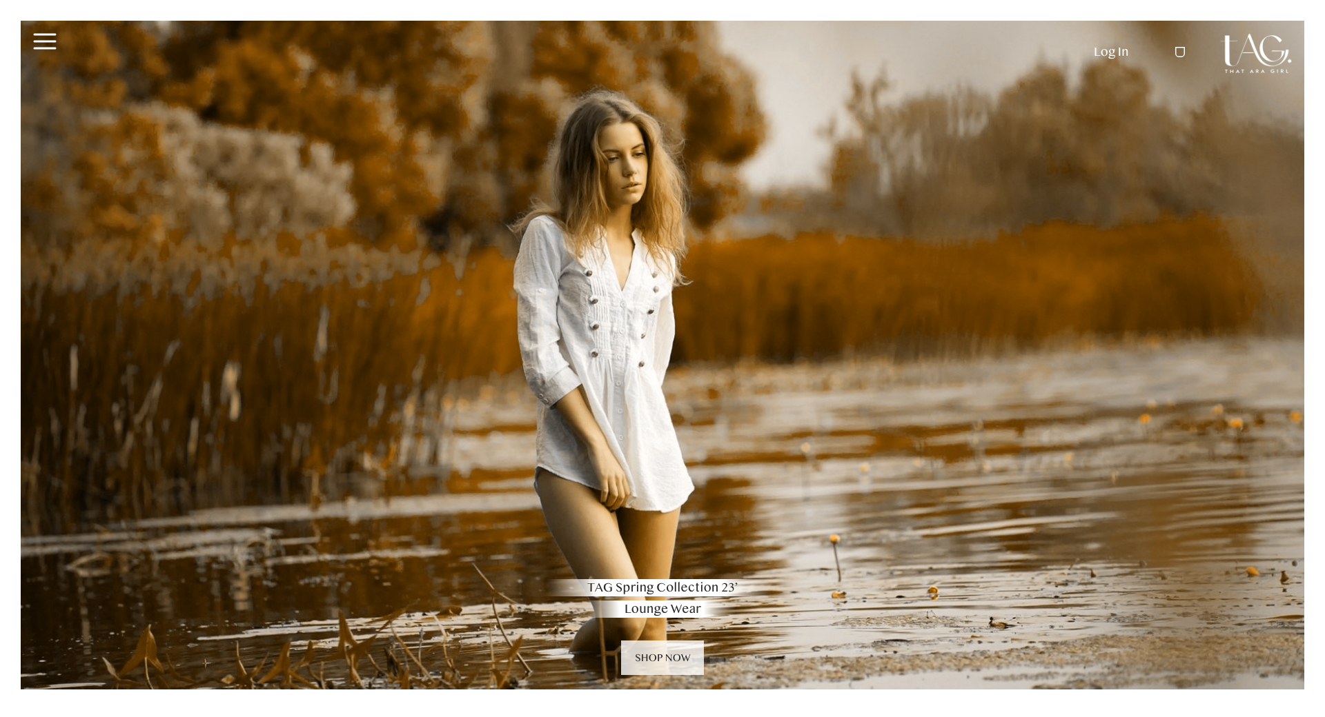
To give more context, when shown the That Ara Girl website it was unfinished as the brand had not launched yet.
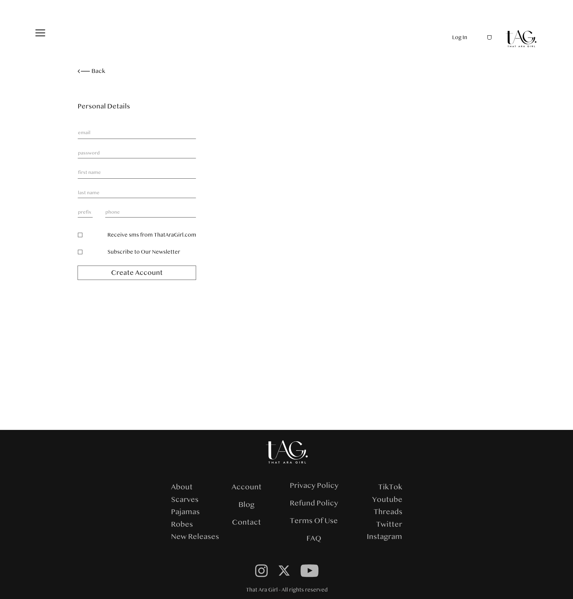
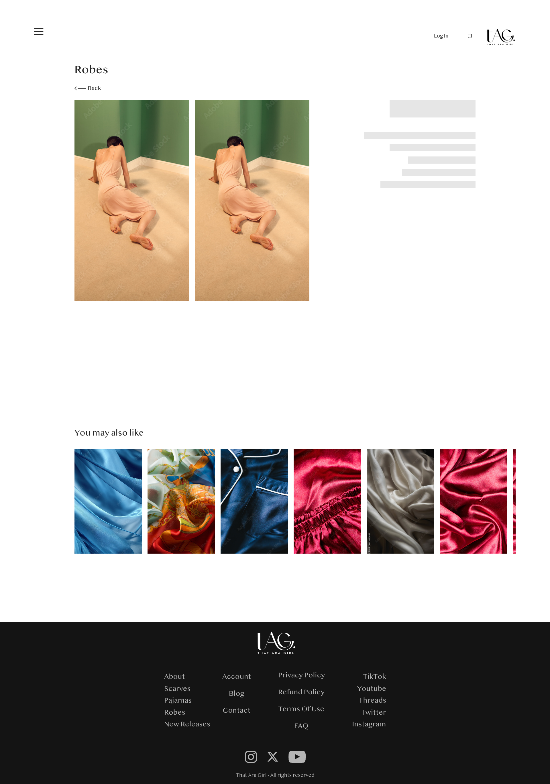
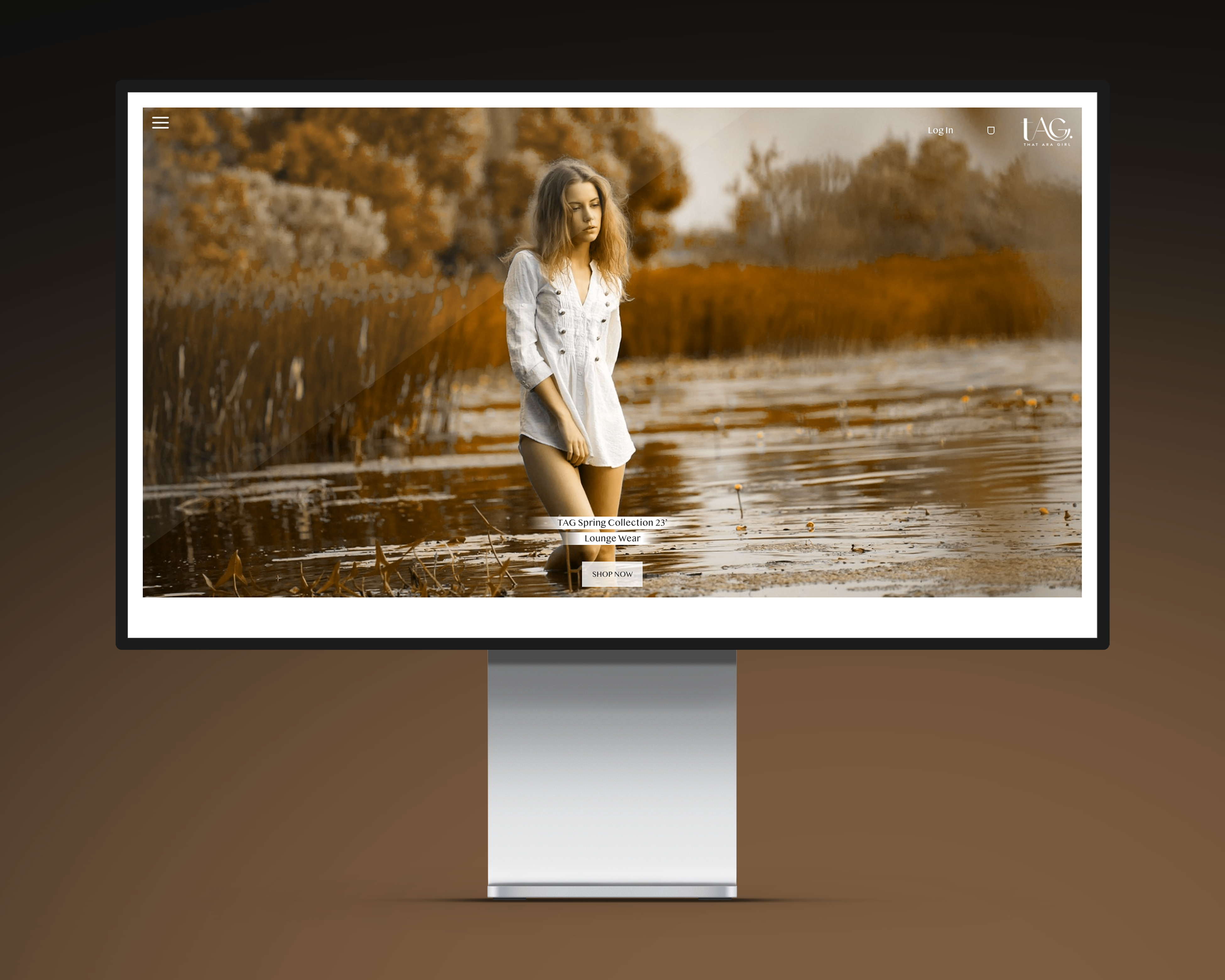
The first rendition of That Ara Girl had clustered sections with a lot of information displayed on the homepage, which I felt was very distrating giving a poor user experience. I decided to simplify it by first starting with the menu navigation, which is expounded on below. After the menu I kept the hero section because it was great use of displaying the products immediately to the user but I added an action button to call the user to click on the images displaying the products.
The next section I wanted to introduce the user to their more important product by featuring it next to a welcome paragraph, providing a breif overview of who That Ara Girl is. The sections that follow are the collection of products, a call to action to the about page, and a subscription form.
The Menu Navigation
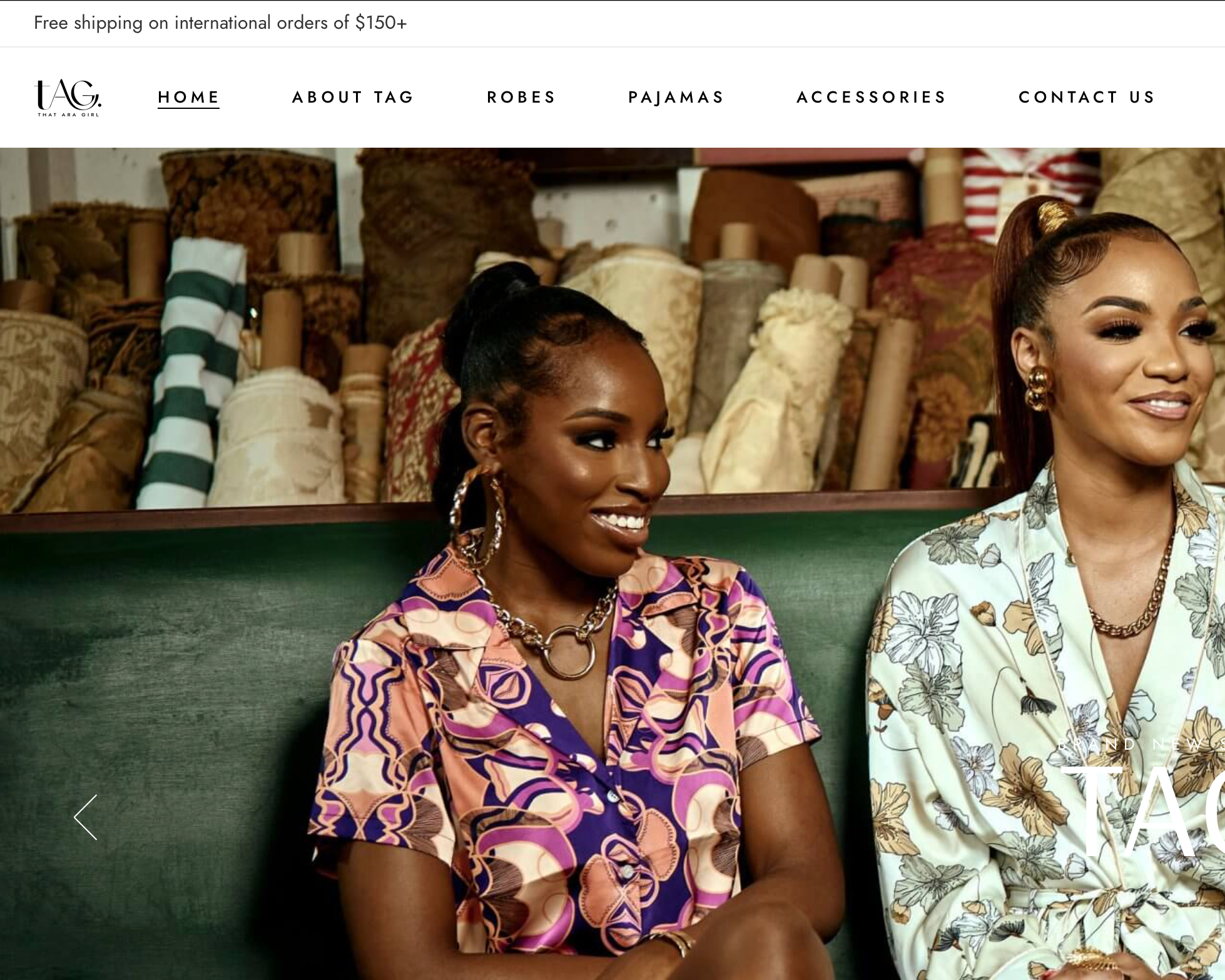
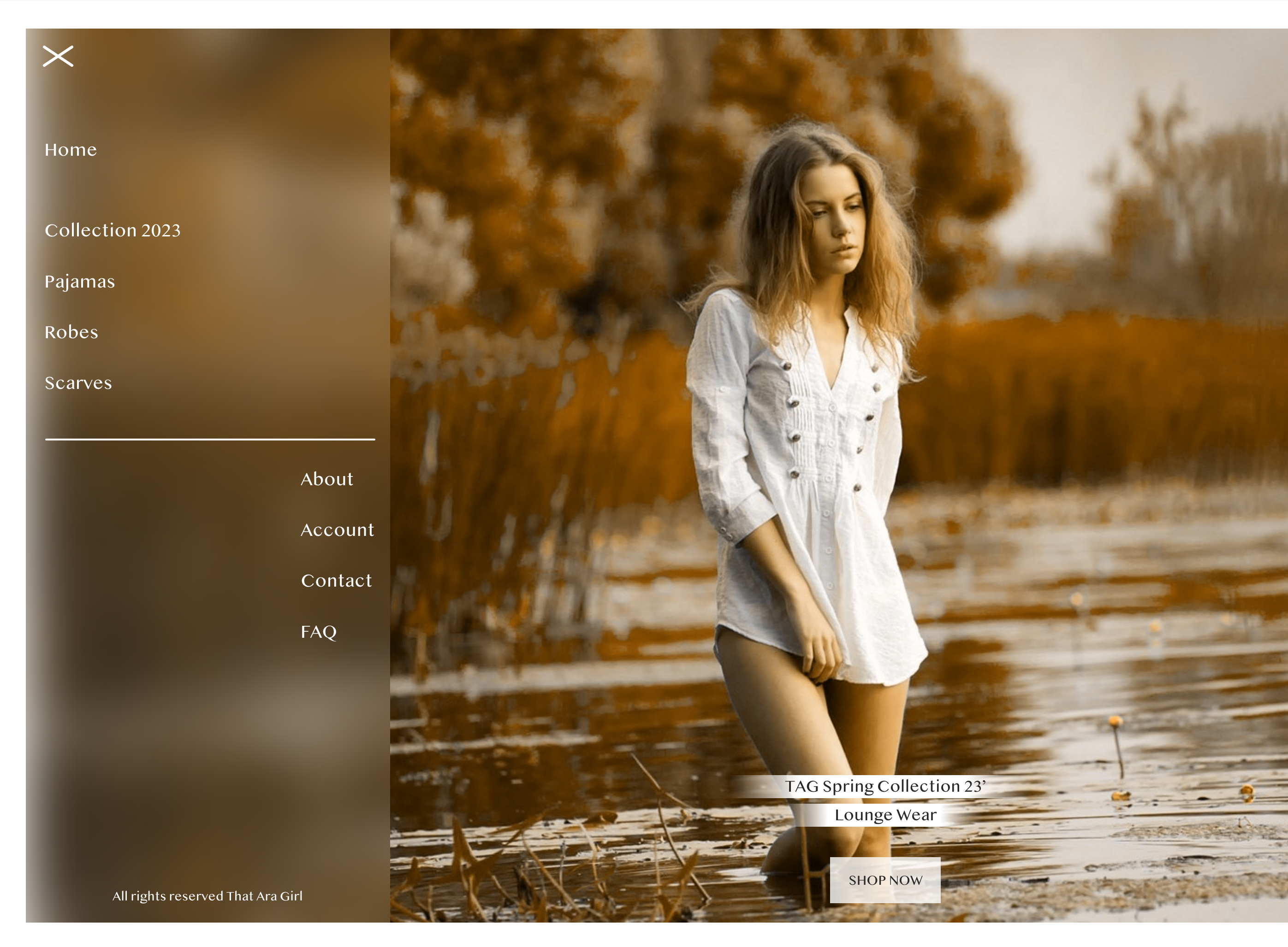
Overall menus are pretty straight forward but because I wanted to simplify this website, I decided to also simplify the menu. Instead of having the website navigation button display across the top of the page or even on the side, I decided to bring the "hamburger menu" that is usually on the mobile version of websites to the desktop. This idea is not an original, but inspired by Zara.com. I felt in order to bring a more luxury feel but also modernism to That Ara Girl, using a "hamburger menu" would add that asthetic and simplicity.
The Color Scheme
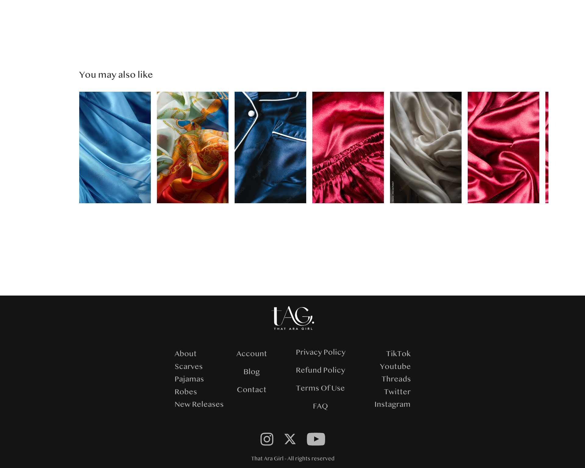
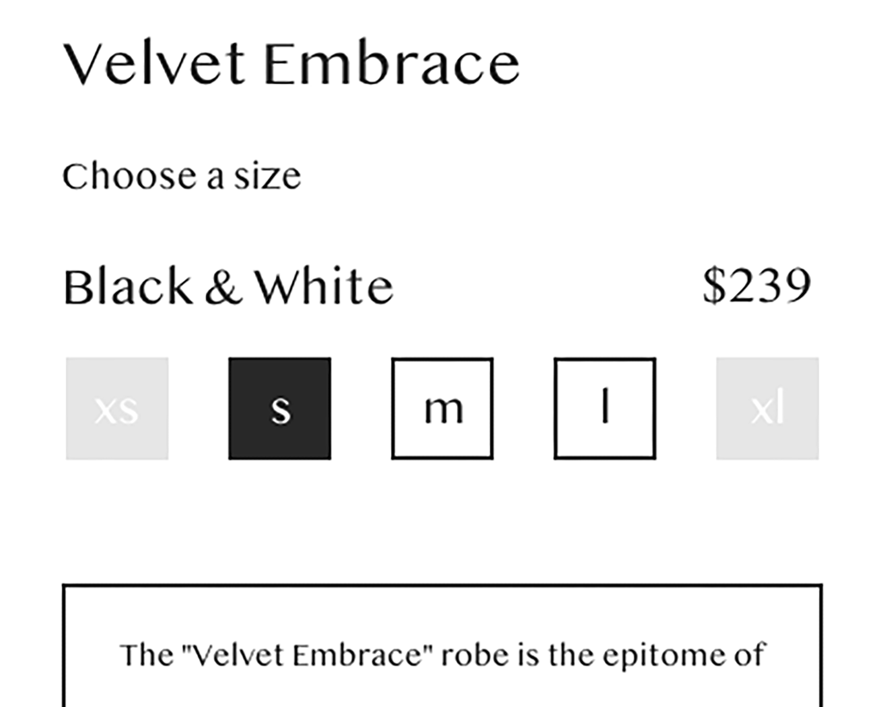
The color scheme adds to the luxury user experience so I decided to use just black and white for the majority of the website with a touch of dark red for buttons. Black and white because they're simple yet powerful colors and the stark contrast they create when used together creates a sense of sophistication and understated beauty. The simplicity allows for a clean and uncluttered aesthetic, often synonymous with luxury and elegance.
The Solution


