My Roles
UX Researcher
Visual Designer
UX Writer
Context
This is a personal design case study, I do not provide design solutions for My Lesson Teachers and what I created does not reflect My Lesson Teachers design goals.
Research and Inspiration
This redesign project consisted of researching competitive sites to get an idea of what kind of information to displayed on the home screen to provide customers with an idea of who My Lesson Teachers are and what they offer, as well as, the UI design and navigation trends.
Goal
My goal was to create a solution that provided the customer with the necessary information to decide if My Lesson Teachers is the right tutoring choice for their child.
What is My Lesson Teachers?
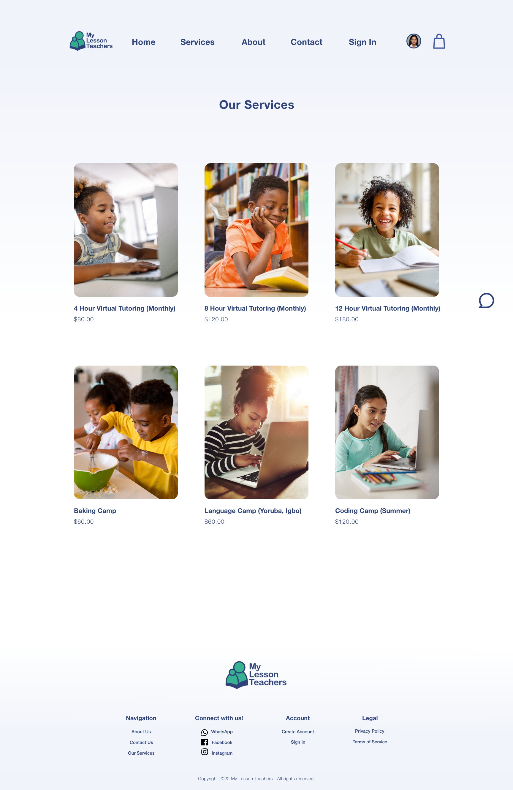
My Lesson Teachers is a name that was derived from a common African custom in which most school-aged children went to Lesson after school and their instructors were called Lesson Teachers. This is a website focused on bringing that custom to the US through virtual and in-home lessons taught mainly by experienced Nigerian Lesson Teachers. My Lesson Teachers provide classes for students in pre-kindergarten to 9th grade, with lessons that include; Yoruba and Igbo language learning, Coding, Baking, and more tailored to the needs of school-aged children.
Here's a breakdown of the changes I've made.
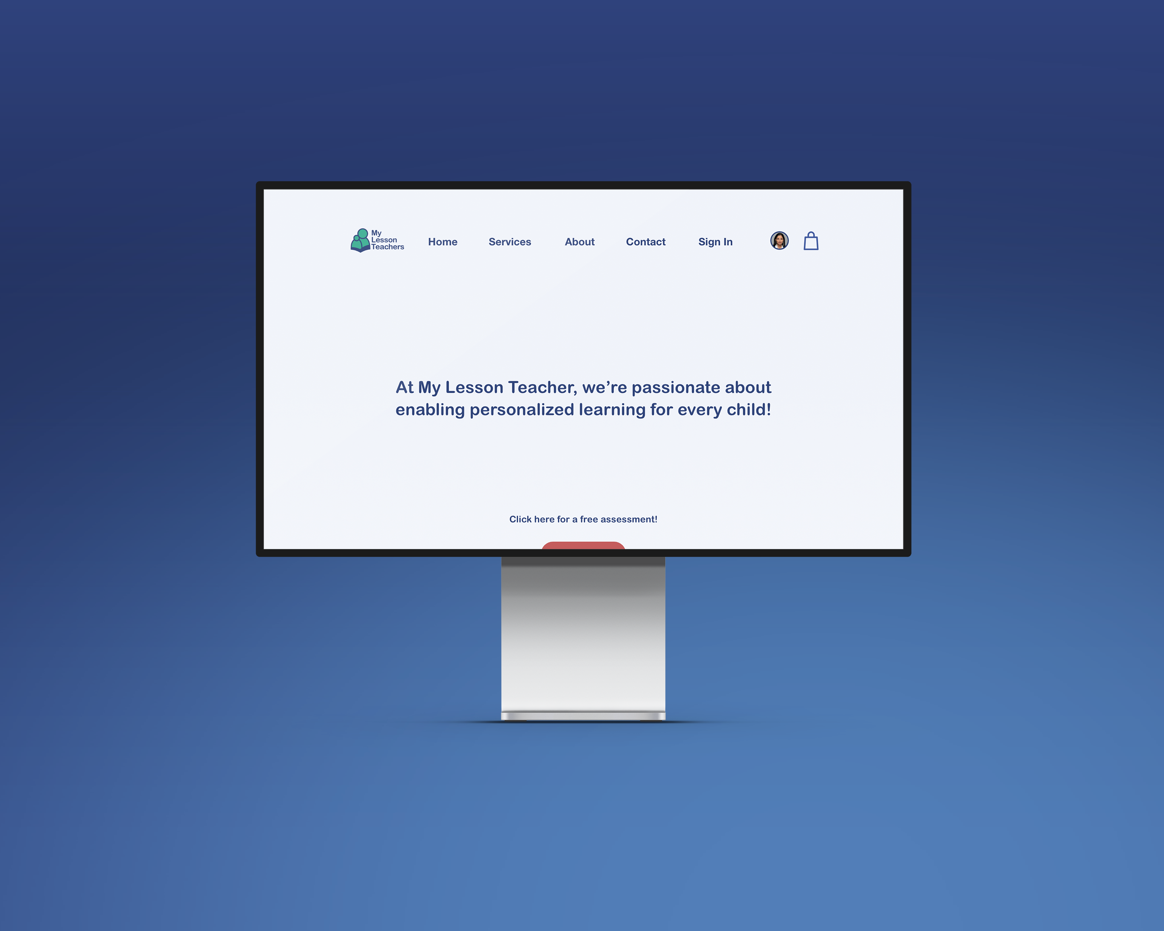
The Logo

The My Lesson Teachers logo is already a decent logo. I decided to clean it up a bit by first removing the one-liner "Affordable one-on-one tutoring for every child". I felt this was unnecessary to be apart of the logo, if the logo was to be resized into a smaller form factor, it would render unreadable. I also felt the logo to have too many components with various texts and font sizes compacted into one unit.
I kept it simpler and allowed for there to be a border around the symbol and created a color scheme allowing the logo to be visible on darker colored backgrounds.
The Navigation
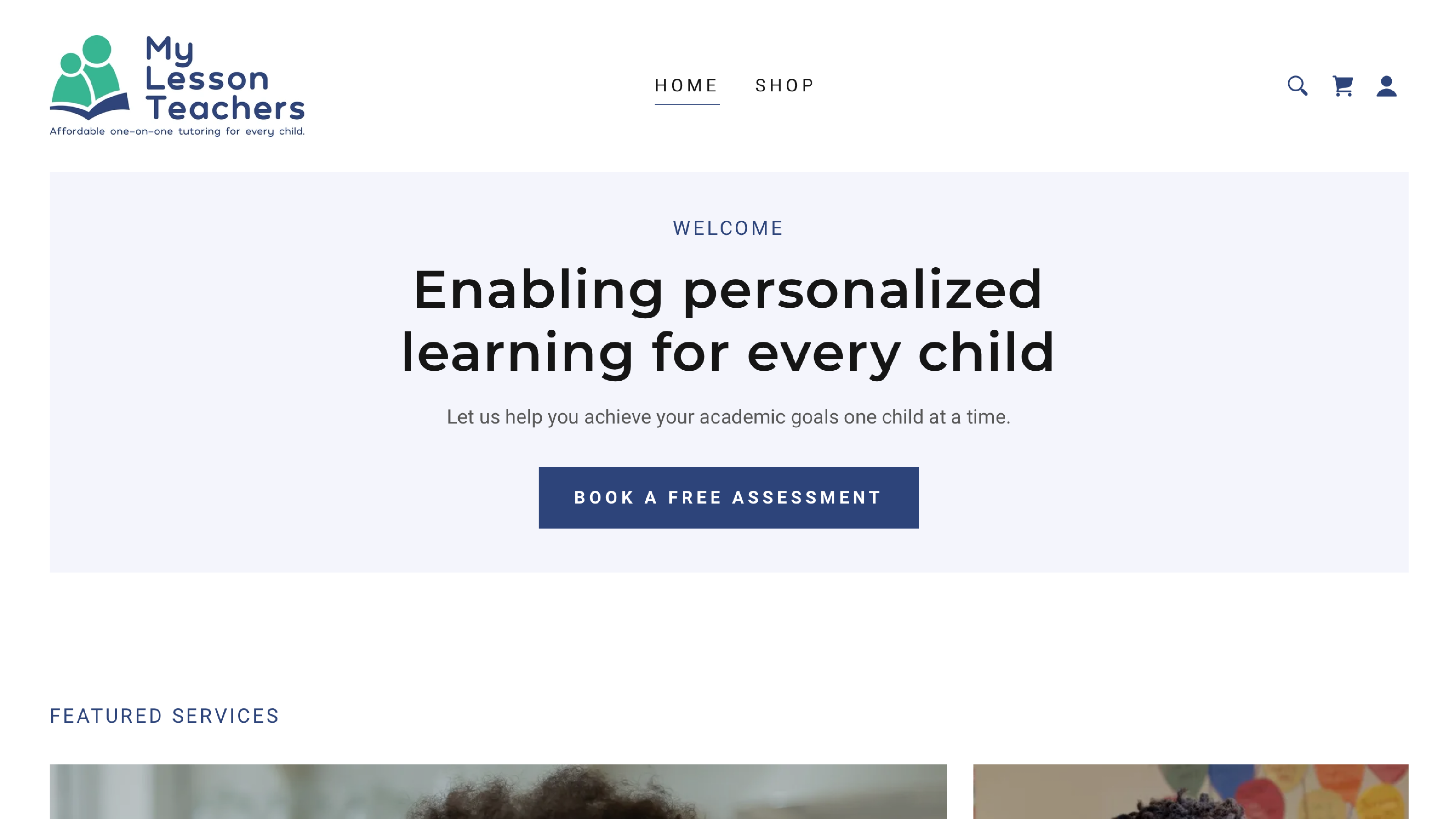
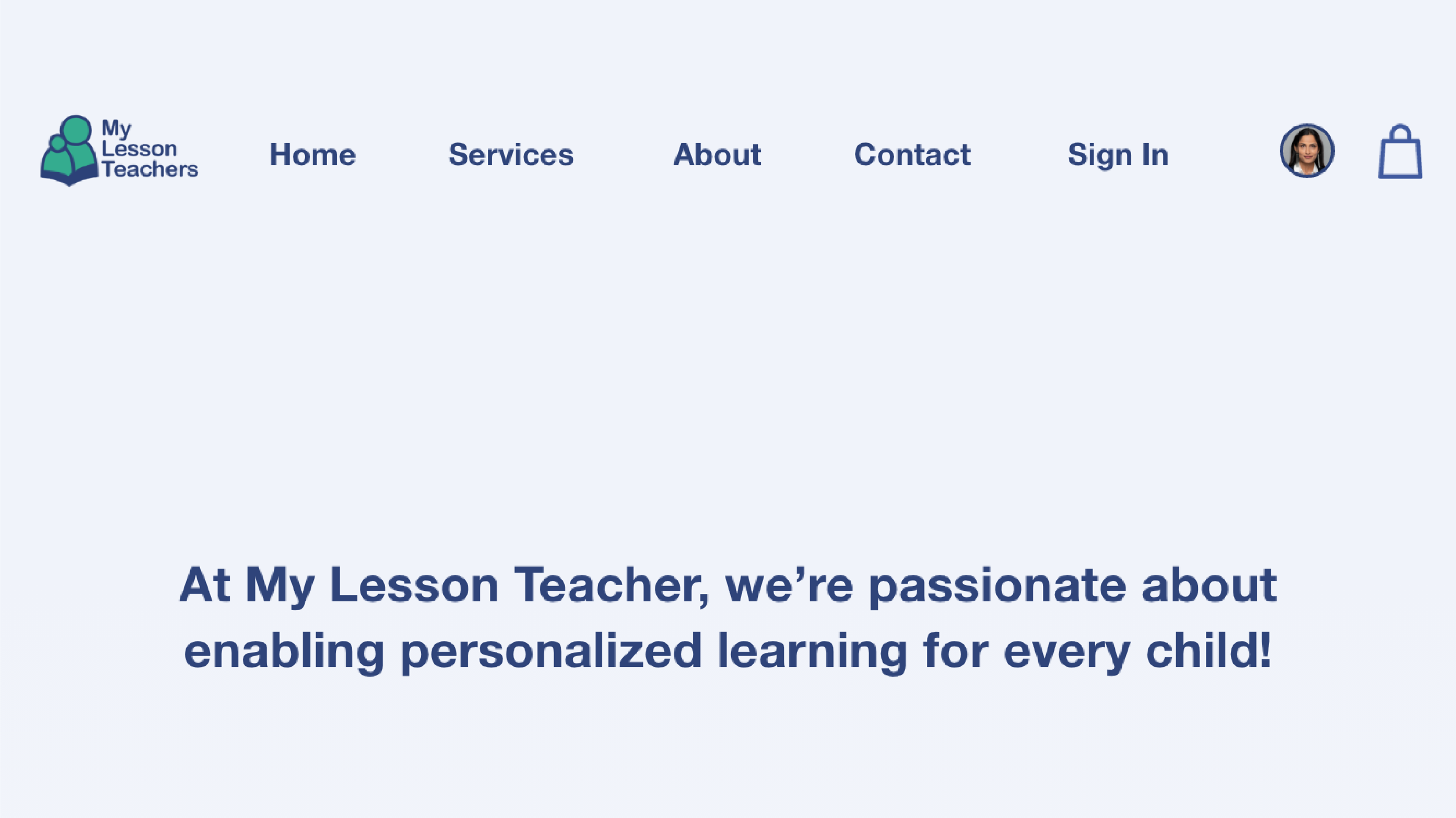
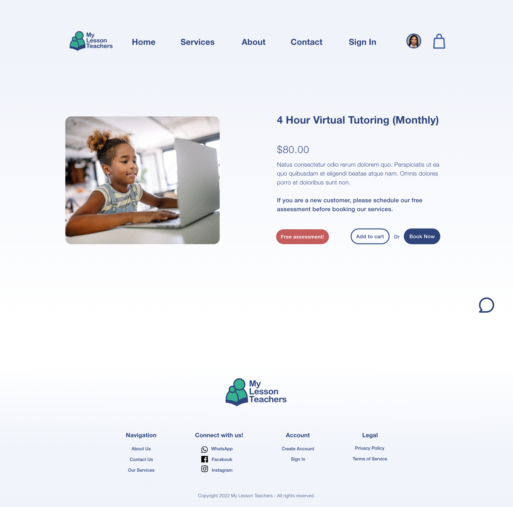
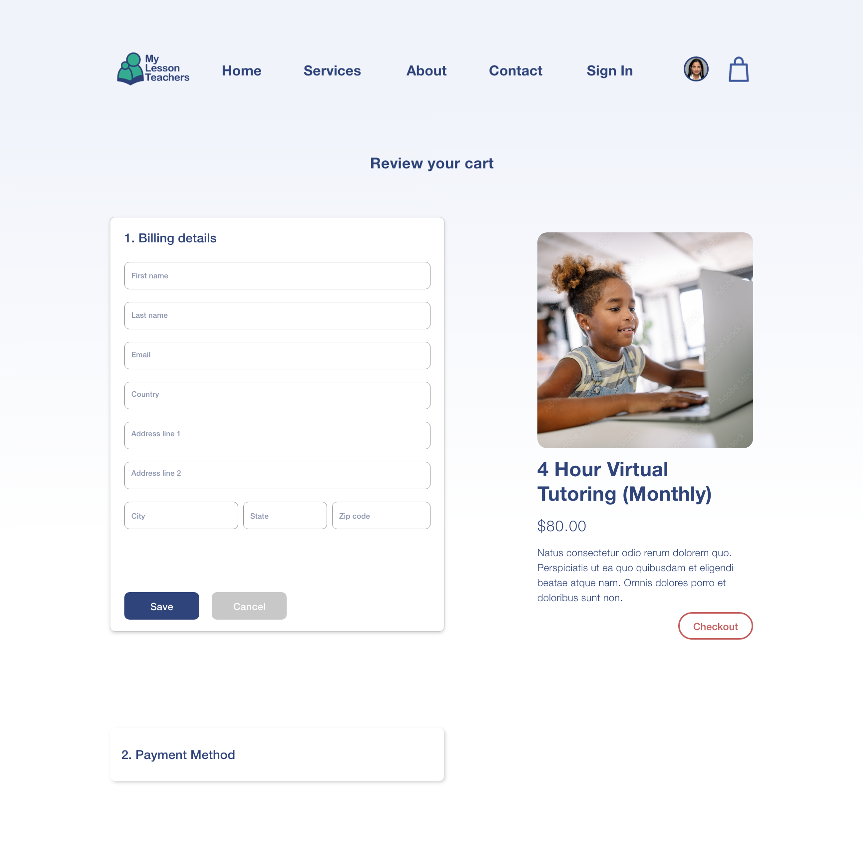
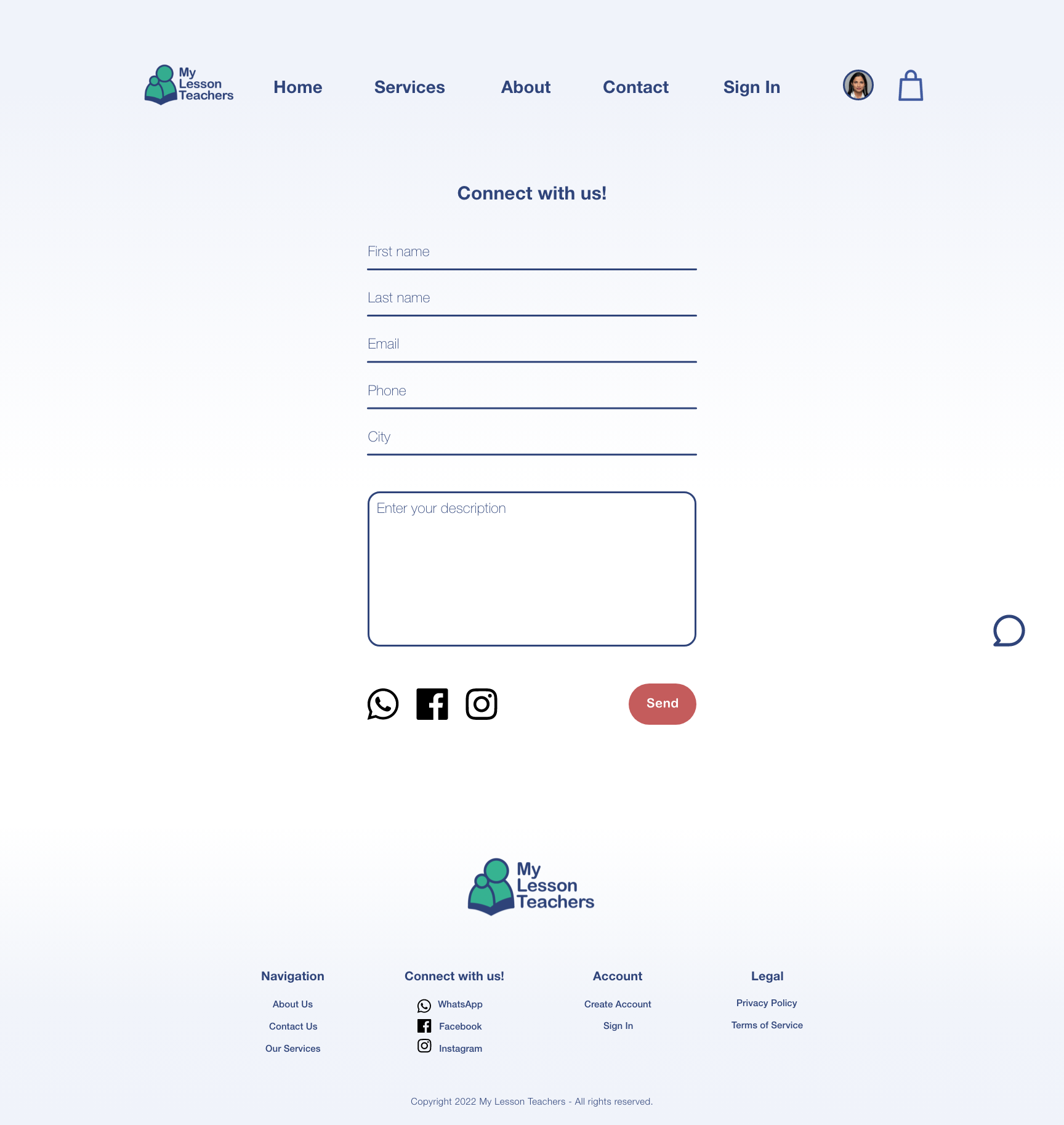
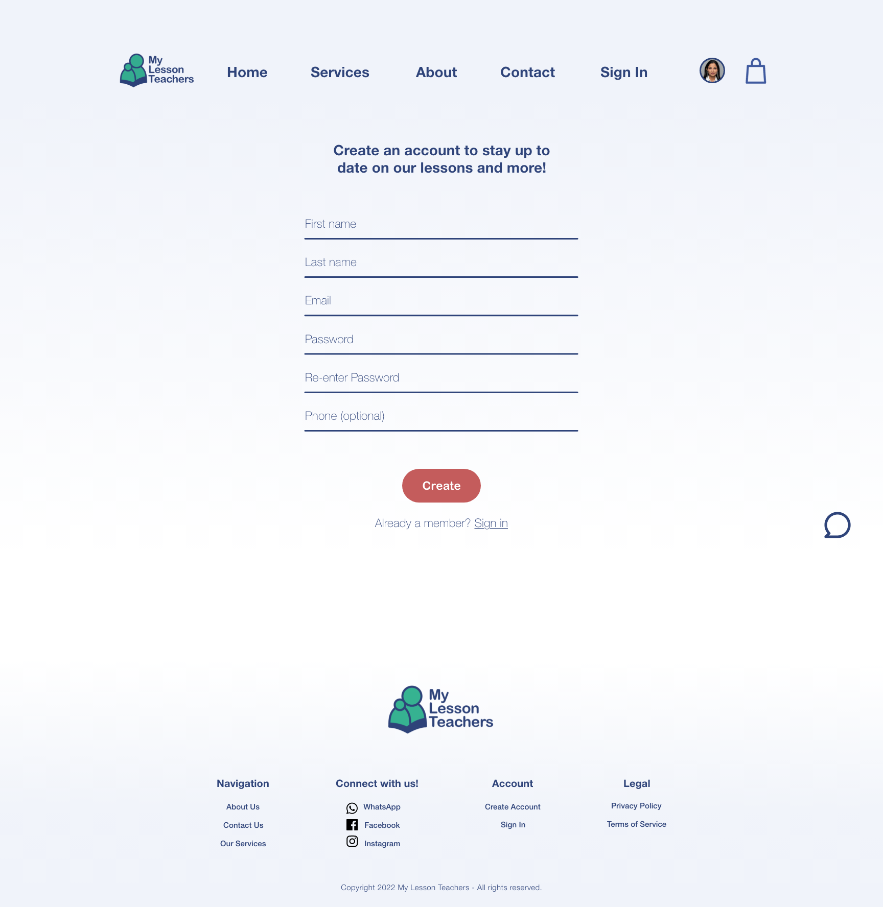
On the original site the navigation bar has 5 options available to the user. One in particular is the Shop button. The Shop button felt out of place because the word "shop" I think has a meaning of merch or physical products to be sold. If merchandise was displayed it would be fine but instead, their services are displayed. I think a Services button would better express the intention behind their Shop button.
Other changes were adding an About button, Contact button and a Sign In button, all of which would be useful for a user to have front and center without navigating the site looking for important information. With these slight changes, I believe the user experience is made more accessible, enjoyable and less frustrating resulting in a better UI design structure.
Site Mapping
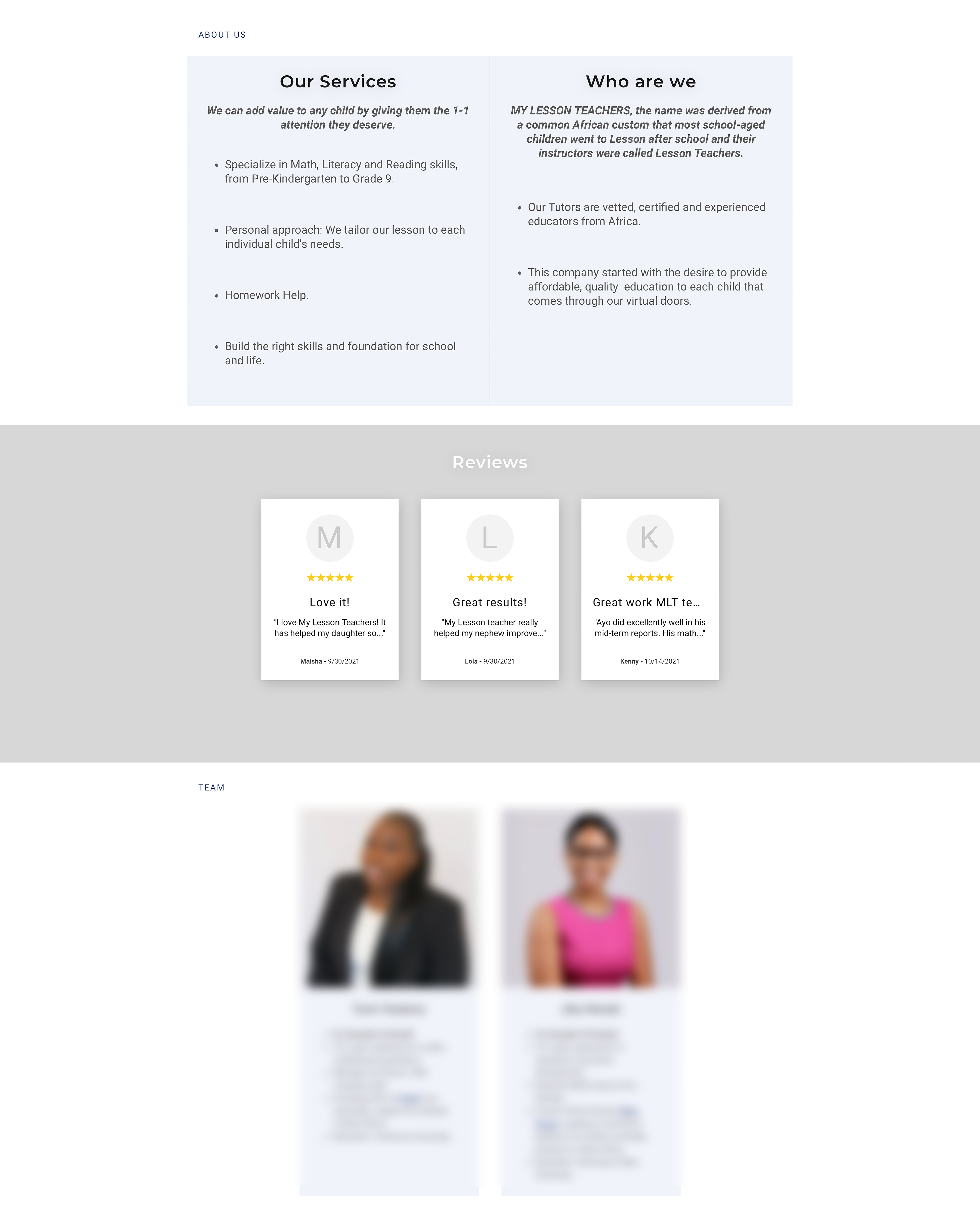

The original website presented users with a few navigation choices. The primary options included the home page and the shop page, which essentially served as the services page. Recognizing the value of clarity and focused information presentation, I aimed to enhance the user experience by segmenting content. This approach ensured that users encounter a manageable amount of data at any given moment. As part of this strategy, I restructured the "about us" section, previously featured on the home page, into its own dedicated page. Additionally, I combined the "team section," which was initially part of the home page as well, into the newly created about page. This separation of information provides a streamlined user journey, enabling visitors to engage with content more effectively.
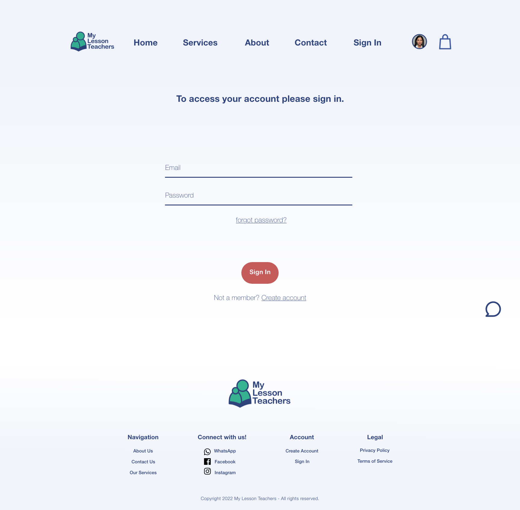
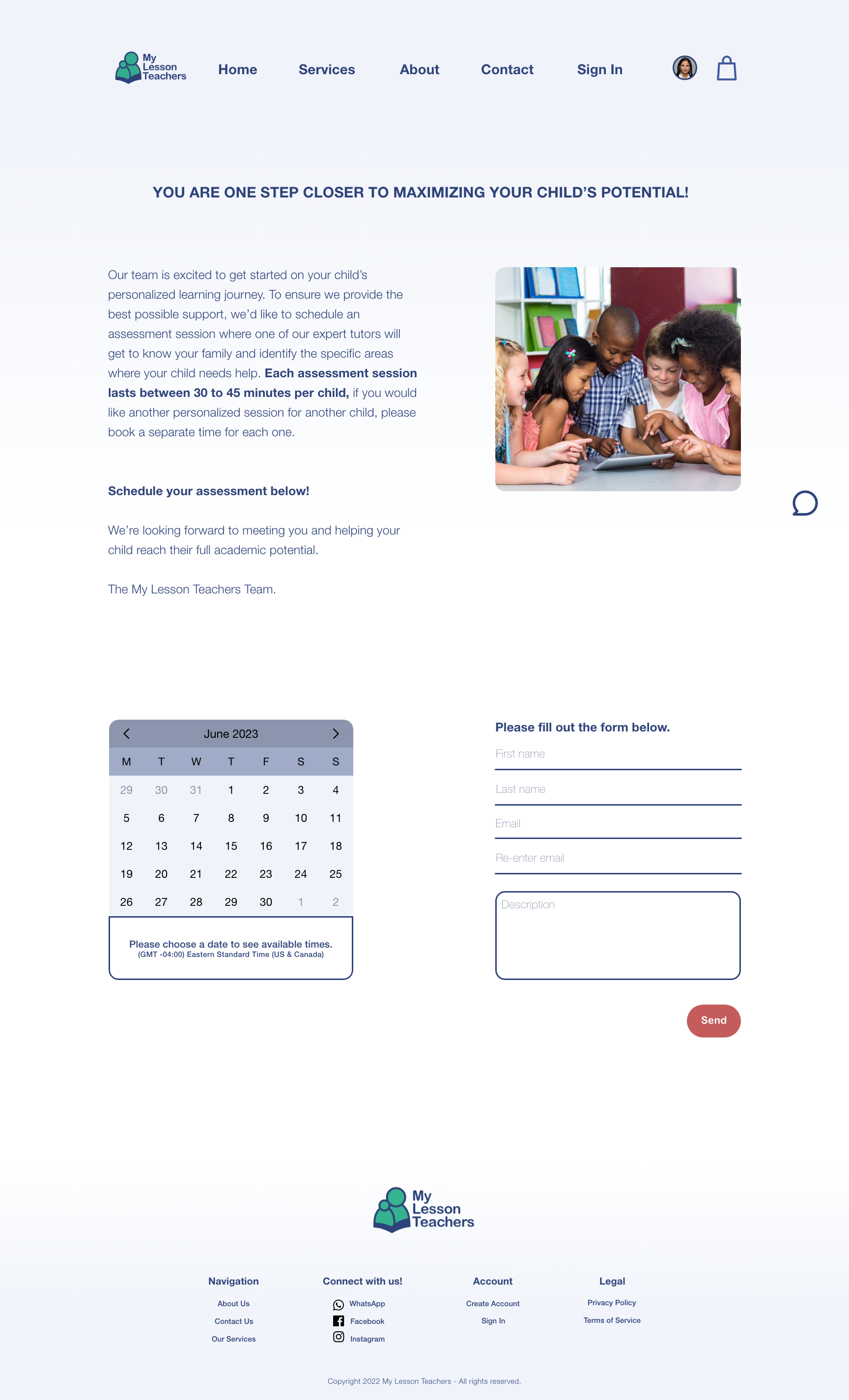
The Solution
Here are all the pages designed by me for My Lesson Teachers.